
Though it is constantly evolving and adapting to fit our changing needs, there are some principals of web design that hold true no matter what the content, style and purpose of a website is.
If you’re thinking about redesigning your site or are already in the process of giving it a facelift, check out these web design lessons that we can all learn from the biggest web giants out there.
 1. Facebook
Facebook has undergone regular updates over the years with each altering the layout and look and the social network.
One of the main lessons we can take from Facebook comes from its layout. Take a look at your homepage and you’ll see that all of the links you need to post, comment, search and message are right there in front of you. Visitors who want to look at more posts from friends and groups can scroll down their news feed at their leisure.
2. Airbnb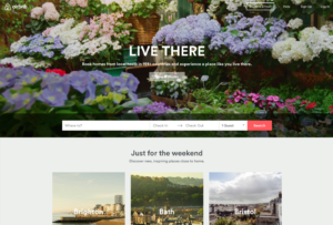
For such a complex business, the Airbnb site is incredibly simple and easy to use. The main homepage is dominated by a full size video, while the copy of the site is limited to essential information only.
One aspect of the Airbnb site that’s especially impressive is the way they’ve placed the focus on credibility, using their star system and reviews to help reassure users that hosts are trustworthy and reliable.
 3. Wikipedia
The Wikipedia site offers a master class in how to keep web design simple. Containing almost no colour, no unnecessary links, no advertising and no gimmicks, Wikipedia is a great example of a content focused site that’s designed with the user in mind.
4. Google
Like Wikipedia, the Google homepage keeps things simple. Though it’s one of the most used and most visited sites on the web, the Google main page is made up of large areas of white space, helping visitors to focus on the search bar and the task in hand.
 5. Instagram
Instagram is a great example of placing the most important content on a site front and centre. Users’ photos are very much the star attraction on the site, with all other content kept to a minimum.
The site is also incredibly easy to use, with the accompanying app helping amateur photographers enhance their snaps and create works of art.
If there’s one thing we can learn from these titanic sites, it’s that less is more. Keeping it simple, focusing on usability and ensuring the most important content is clear and easy to find will help you to create an eye-catching site that’s stylish and practical
Get in touch with a member of our team to find out more.