
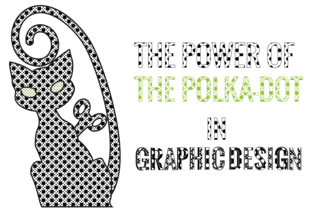
Of all the patterns that appear in graphic design, the polka dot is one of the most versatile, eye-catching and has stood the test of time. After first appearing in the world of fashion in the mid-19th century, this spotty design has been used in countless art and graphic design works, adding visual interest, fun and a quirky touch to all of them.
In fact, the polka dot is so iconic that many artists and designers have based entire series and brands around the aesthetic, creating iconic works in the process.
Damien Hirst
One of the most famous British artists of all time Damien Hirst has used the polka dot in some of his most instantly recognisable works. Known as the ‘Spot Paintings’, the simplicity of Hirst’s pieces have inspired countless artists and graphic designers and have created a brand new aesthetic all of their own.
Cath Kidston
One of the most famous contemporary designers around, Cath Kidston has taken full advantage of the creative potential of polka dots in designs across her collection.
By using polka dots to add interest and character to the background of her designs, Kidston has managed to create a unique aesthetic and an instantly recognisable brand. Even when the dots themselves are replaced with flowers or birds, the regular intervals and geometry of the underlying polka dot design still helps to unify the piece and make it stand out.
Roy Lichtenstein
By appropriating an aesthetic first used by comic books, Roy Lichtenstein took the polka dot to brand new heights. Working in the 1960s Lichtenstein helped to bring the pop art movement to prominence, create a unique and iconic aesthetic of his own as he went.
Work inspired by Lichtenstein can be seen across the web, with thousands of websites, products, apps and logos bearing elements of his ideas.
She Who Bakes
Another fine example employing the power of the polka dot (if we do say so ourselves) is She Who Bakes. 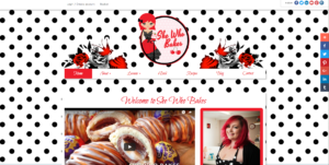 Designed by the creative cats at Clockwork Moggy, the site uses elements of pop art to create a striking aesthetic. The monochrome polka dot background helps the content to jump off the page, giving the site a strong identity and an instantly recognisable look.
Inspired by the strong personality of the site, and the artistic preferences of the client, the look of the site combines classic elements of pop art and contemporary digital design.
To find out more about our designs and the work we do, have a look around our site or get in touch with one of the members of our creative team.
Greetings! Quick question that’s completely off topic.
Do you know how to make your site mobile friendly? My website
looks weird when browsing from my apple iphone.
I’m trying to find a theme or plugin that might be
able to correct this issue. If you have any suggestions, please
share. Many thanks!
Hi, responsiveness (or mobile-friendly-ness) is usually built into a website from its conception and is not something that we would recommend using a plugin to add.
What CMS do you use? Many will have this feature already built-in, also your theme will need to be responsive so have a look at that too. It’s a little more tricky than just a quick fix. In what way does your website look weird?
Howdy! This post could not be written any better!
Reading through this post reminds me of my good old room mate!
He always kept talking about this. I will forward this article to him.
Pretty sure he will have a good read. Thanks for sharing!
Glad you enjoyed it! Thanks for reading and sharing!