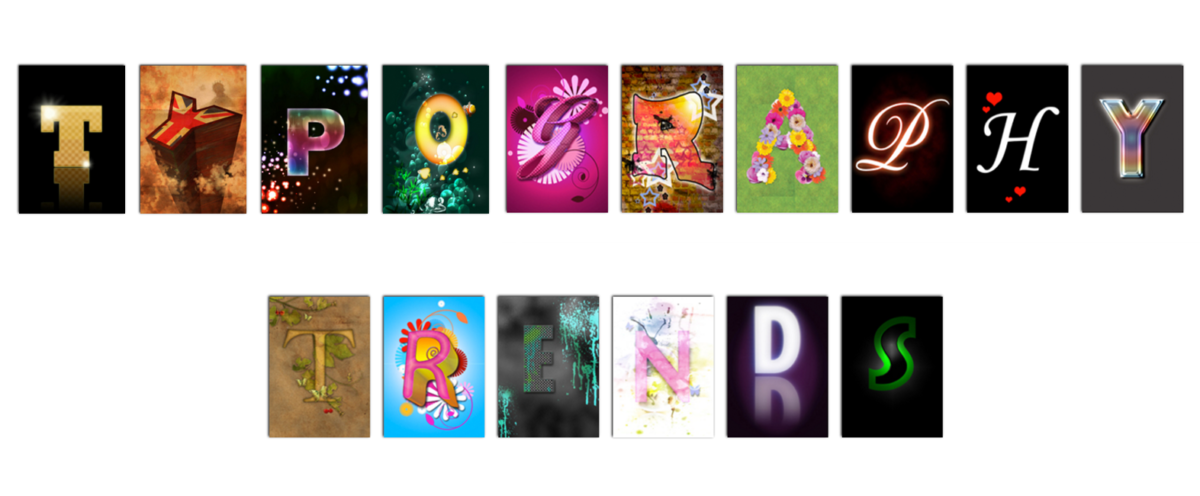
Whether you notice it or not, typography is an integral part of your internet experience. Every website you navigate to has chosen its font for a reason, with every embellishment, adaptation and innovation designed to influence your impression of the site and affect the way you think about the brand.
As with any kind of design, typography styles change over time. To make sure that your website and printed materials are contemporary and on trend, take a look at the most influential typography trends of 2015.
Handwritten Fonts
Though handwritten fonts have been around for a while, 2015 has seen a big increase in their use and popularity.
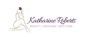
Perfect for startups, small independent businesses and larger companies trying to create a more personal feel, hand written fonts are best suited to titles, headings and other small segments of texts and when matched with a hand drawn logo or icon can look spectacular.
Dramatic Fonts
Though many designs rely on images and graphics to create eye-catching looks for their sites, type can also be used to great effect when building a dramatic and arresting design.
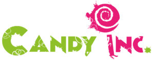
Large, oversized text and fonts that have been adapted to suit the context of the site and the client company are fantastic for creating drama and visual interest using text alone.
Photo Overlays
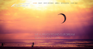
As the internet becomes more photo and video heavy, increasing numbers of designers and web designs are creating home pages that are built around a single image.
This is example is from a Dutch wind surfing website (http://www.isurfnl.com/)
Typography is then used over that image to create a striking, simple design with a huge amount of impact.
Back to basics
As well as beautifully embellished fonts and intricate headings, we’ve also seen a move towards a more basic typography style throughout 2015. Using strong, simple lines and clear, concise fonts, designers have been creating a range striking typefaces with a unique graphic element.
Perfect for modern companies and businesses that want their site to look a bit different, this look is one that’s set to grow in popularity throughout the coming months.
Vintage Type
The use of vintage type has increased considerably over the last few years. Full of character and with a distinct quirky touch, this kind of type is ideal for companies that want to connect with their audience and show that they have the personal touch.
As a central part of any digital or print design, typography needs to be selected carefully and thoughtfully. To find out more about choosing the perfect font for your next project, talk to a friendly member of the Clockwork Moggy team today.

