
Single Screens, Scrolling and Saying Goodbye to Chrome
With everything in the world of the web moving so quickly, keeping up with the latest fashions, trends and innovations isn’t always easy. Things that are new and exciting one day are yesterday’s news the next and sites that haven’t been updated for a year or two can begin to look very dated very quickly.
To make sure that your website, app and other online trappings look as fresh and as vibrant as possible, we’ve put together a list of some of the biggest and best web trends of 2015 for you to feast your eyes on.
No Chrome
When talking about web design, the term ‘chrome’ refers to all of those containers, borders, headers and footers that can be found encasing many a web page. Recently, designers have begun rejecting this standard format, opting instead for cleaner layouts and less visual clutter.
This crisp look is ideal for a number of contemporary sites and helps to focus the user’s eye on the content displayed. Sleek and slick, sites without chrome are perfect for retailers, bars, cafes and any business that wants to get their message across with minimal fuss.
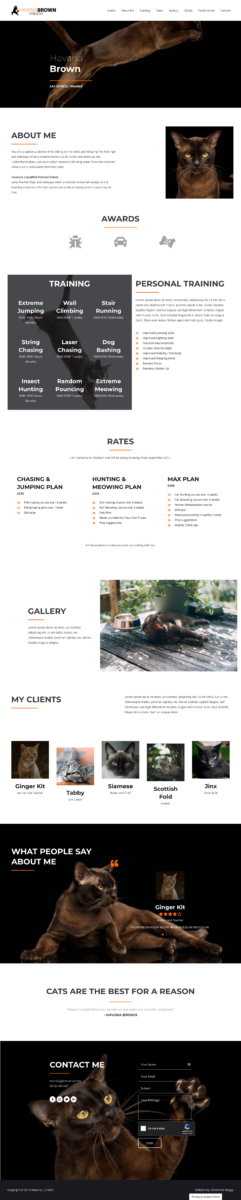
Single screen layouts
The majority of the sites that you visit on the web will have at least one column down the side and will often have a vertical or horizontal menu somewhere on the page.
Single screen layouts, on the other hand, are unadorned, with a single background image or piece of text adding impact to the design. This minimalist looks gives sites a more televisual feel and is perfectly suited to businesses that want to create a strong brand identity and company aesthetic.
Websites built for scrolling
The mobile internet has already had a big impact on the world of the web with more and more sites responsively designed and optimised for users surfing from their phone or tablet computer.
As increasing numbers of people use their thumbs instead of their track pads or mice, websites will begin to be designed with thumb scrolling in mind. This means that targets (the links that you want to click on) will be further apart and often individually positioned on the page, making it easier for mobile users to find the information they’re looking for quickly and easily.
Big backgrounds
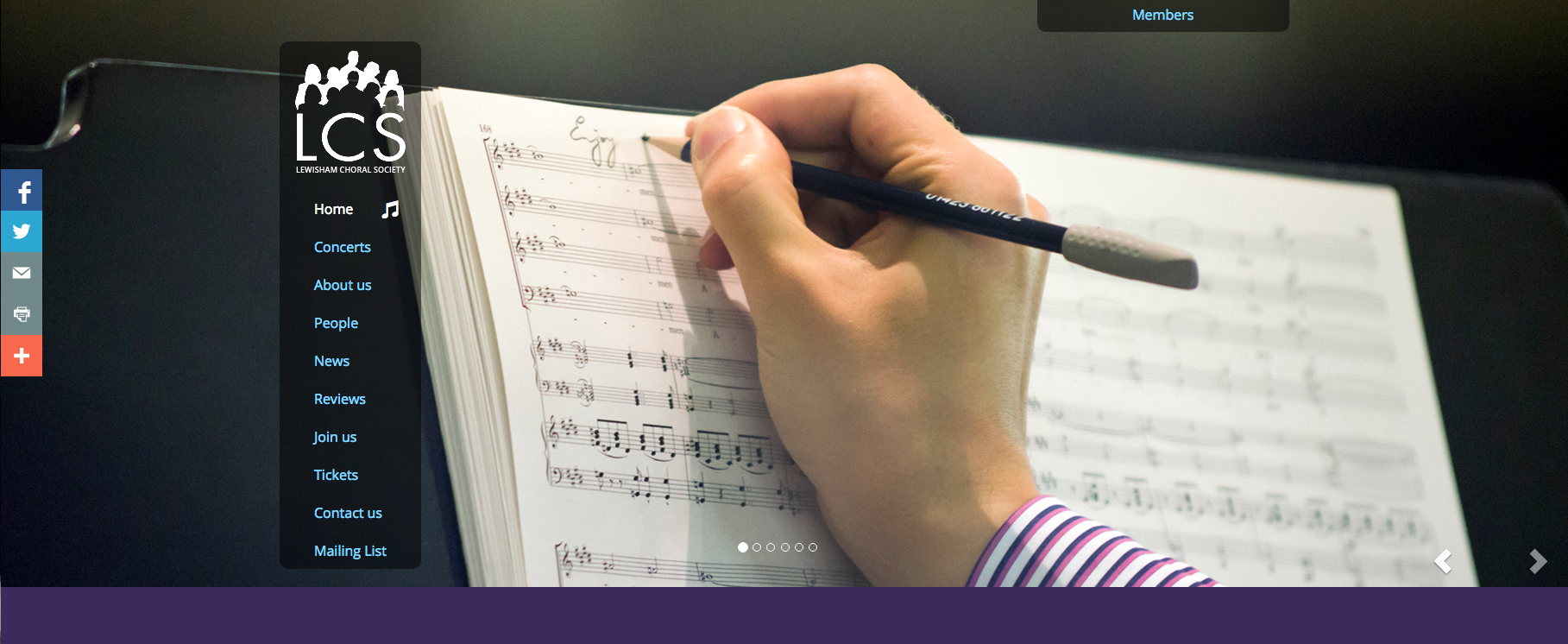
The use of big, bold images and videos on websites has been on the up for several years now. What we’ve seen a lot of in 2015 is the use of photos, illustrations and videos as the sole background of websites.
A fantastic way to give a site a huge amount of visual impact, big backgrounds are sure to have a big impact throughout the coming year.
If you want to make sure that your site is up to date and ready for the now, the nearly now and what’s next , get in touch with the team at Clockwork Moggy today.