
– from Alphabet to Algorithms
With well over a billion unique visitors using Google every month, the search engine is by far the biggest in the world, eclipsing Bing, its closest rival, which sees just 350,000,000, unique monthly visitors – almost a third of that of the front runner.
As a result, the entire online world hangs on Google’s every move and the ripples from even the smallest changes and updates can be felt in every web design office, graphic design studio and marketing agency on earth.
So with its three big changes this year, the internet giant really had the ever changing world of the web talking. Impacting everything from web design and branding to company structure, these changes have made 2015 a gigantic year for Google and an important year for everyone who works online.
Algorithms
Google started its year as it meant to go on, announcing big changes to the criteria that it used to rank websites.
Nicknamed ‘Mobilegeddon’ the updates, which came into force on April 21st, meant that Google would begin to favour websites that were optimised for the mobile web.
This has lead to the redesign of thousands of sites, with webmasters looking to make pages easier to navigate, faster to load, responsive and generally simpler and more enjoyable to use from a mobile device.
Alphabet
After keeping the digital world on its’ toes with their updated algorithms, Google then proclaimed that it was changing its name – sort of.
August 10th 2015 saw Google announce that it was creating a new public holding company called Alphabet. With the URL abc.xyz, the new company would own many of Google’s subsidiaries including Nest, Calico, Google Ventures and Google X as well as Google itself.
The move is meant to make Google’s operations cleaner and more accountable while allowing its subsidiaries to focus on pushing the boundaries of technology and innovation, all without putting the web giant at any risk.
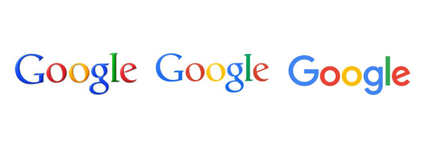
Logo
Just a few weeks after the advent of Alphabet, Google was at it again and proved their penchant for change, this time by giving its internationally recognised logo a facelift.
In line with modern wed design trends, Google has removed all unnecessary flourishes from its logo, muted its trademark colours and flattened its formerly 3D font.
Though the new logo has provoked Marmite-esque reactions across the world, the design does reflect contemporary web design, with many brands replacing their flowery fonts and intricate etchings with cleaner, simpler and more eye-catching alternatives.
From its algorithms to its image, Google has made a lot of changes in the last twelve months. And with digital design, online trends and technical innovation moving faster than ever. And this pace of change shows no sign of slowing in the immediate future.
To make sure that your website is up to date and ready for the today, tomorrow and beyond, get in touch with the team at Clockwork Moggy and we’ll help you give your brand the contemporary touch.